


Labor effect
Why go through Dafolle?
Choosing your brand colours based on a personal whim? Bad idea.
Following the Pantone trends of the year blindly? Even worse.
Your colours must serve your strategy. Period.
The right method in 3 steps:
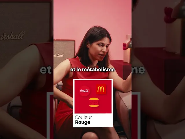
1. Define the target emotion
Do you want to inspire trust (blue), stimulate action (red/orange) or evoke nature (green)? Each colour triggers a measurable psychological response.
2. Analyse the competitive context
If all your competitors are blue, you have two options: either adopt blue as well to reassure (risk of commoditisation), or take a radically different colour to stand out (risk of sector confusion).
3. Test the variation
A colour that pops on a logo may become illegible on packaging or degrade your conversion rates in CTAs. We test. Always.
At Dafolle, we never offer you "3 palettes to choose from because we thought it looked nice". We build your palette based on your brand platform: who you are, what you want to evoke in your clients, where you will use these colours.
Result: a visual identity that performs. Not just one that pleases.
And if you want to see how we apply this concretely, take a look at our branding projects. Every palette has a reason to exist.

Clara Champion
Published on
The chill corner & brain food.


English