


Labor effect
Why go through Dafolle?
Uber Eats has spent millions on UX research. And it shows in every pixel.
Analyzing their app is like lifting the hood of a Formula 1: every detail is optimized for performance.
What I noted:
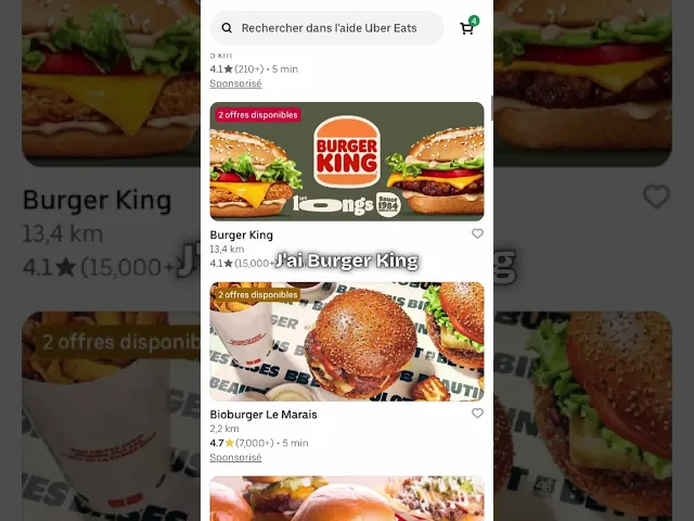
Product photos
Always appetising, always in the same framing, always with the same lighting. The result: your brain instantly knows it's good before even reading the description.
Information hierarchy
Price, delivery time, rating: in that order. Not by chance. Their data showed them that this order converts the best.
Micro-interactions
The little "+1" that appears when you add an item. The "Added!" that confirms the action. These details create an immediate satisfaction that encourages ordering more.
The accepted dark pattern
The "Place order" button is huge, neon green, impossible to miss. The "Cancel" is small, grey, discreet. Is it manipulative? Maybe. Does it work? Absolutely.
At Dafolle in product design, we apply these same optimization principles. Not to manipulate your users, but to create smooth journeys that naturally convert.
Because good design is not just "pretty". It's effective.
Do you want to optimize your app or your SaaS platform? We can conduct a UX/UI audit like this and offer you concrete improvements that boost your conversions. Without changing your entire app.

Clara Champion
Published on
The chill corner & brain food.


English