


Labor effect
Why go through Dafolle?
Invoxia manufactures smart GPS trackers. Their app? A UX nightmare before we intervened.
The classic problem with tech products: too many features, not enough hierarchy, an interface unreadable for new users.
Our diagnosis:
Advanced users loved all the options available.
New users abandoned the app within 48 hours.
The activation rate of premium features was catastrophic.
Our approach: progressive disclosure. Simplify the default interface, making advanced features accessible but not imposed.
Results after redesign:
+40% retention at D+7.
+120% activation of premium features.
NPS rose from 42 to 68.
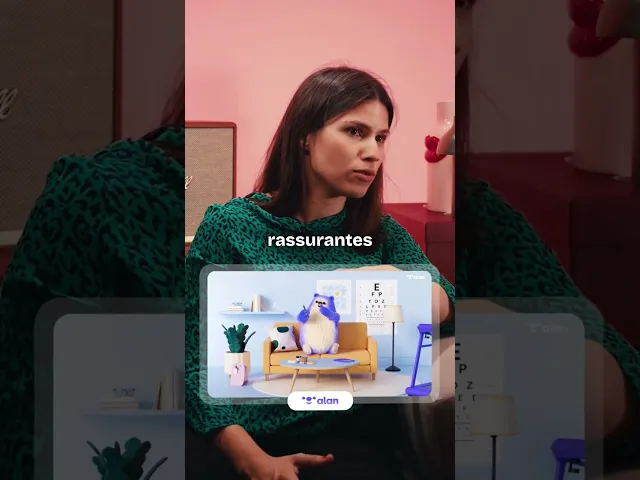
The secret? We didn’t reinvent the app. We just applied the product design principles that work: clear hierarchy, gradual onboarding, reassuring micro-interactions.
If you have a SaaS product or a complex app that is losing users along the way, this is exactly the type of mission we love at Dafolle.
No need to redo everything. Just identify the friction points and eliminate them methodically.

Clara Champion
Published on
The chill corner & brain food.


English