

Think about where your logo will be
Why work with Dafolle?
Will your logo be a sewn badge, a discreet embroidery or a metal engraving?
This question may seem trivial. It is not.
The placement and treatment of your logo define the desirability level of your product. A poor choice turns a premium brand into a budget brand. Even with a beautiful logo.
Look at Patagonia: their logo is tiny, discreet, almost invisible. But it is enough to instantly identify the brand. Why? Because the placement is consistent with their positioning: authentic, not ostentatious.
In contrast, some brands slap their logo in XXL on all their products. Result: guaranteed cheap effect.
The three questions to ask yourself:
Where will the logo be seen? (packaging, product, digital, all media?)
What level of visibility do you want? (ostentatious vs discreet)
What marking technique? (printing, engraving, embroidery, relief...)
At Dafolle, we do not just create a logo. We think about its identity system: how it lives across all your media, what variation to use depending on the context, what minimum size to respect to ensure legibility.
Good branding is a logo designed for all its uses. Not just a PNG file in a folder.

Clara Champion
Published on
The chill corner & brain food.
The power of colors

The Alpagga case
How to choose your brand color
Breaking down Uber Eats
The Invoxia case
I'm jealous of this site

What makes a good designer?
A "trendy logo" makes no sense
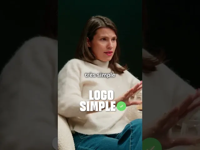
The Leverage rebrand